When the National Network for Equitable Library Service (NNELS) first reached out to us to rate our platform, we didn’t even get a passing grade for accessibility. Looking at a number of different aspects, their report told us we had a long way to go to make our interface accessible to persons with disabilities — and they were right.
The NNELS report was just the push we needed to build a new iteration of our platform that would prioritize accessibility. PressReader Accessibility would make it easier for people with visual and motor impairments to read the content they’re interested in, in a format that made sense for them. To bring this to life, we gathered a team of passionate individuals that put all their energy into building a product that would do our readers justice. The result? We built a Level AA WCAG 2.1-compliant tool that’s custom-created for those who need it.
One of the great things about the NNELS review is that it allowed us to really think about libraries and their patrons when we were building the solution. Not only did PressReader Accessibility have to solve problems for individual users, it also had to be compliant with global regulations so that libraries could meet the standards and requirements set by their associations. Here’s how we did just that.
See also:
- How the South African Library for the Blind is making content accessible with PressReader
- How Edinburgh City Libraries protects and empowers its most vulnerable populations
- The story behind PressReader's accessibility features
Helping libraries foster accessibility
When it comes to offering accessible services for patrons with disabilities, libraries around the world have to abide by mandates and standards set by their national associations or government bodies. For web resources and digital tools, these standards often point back to the Web Content Accessibility Guidelines (WCAG), a set of recommendations developed by the World Wide Web Consortium (W3C).
The WCAG was developed under the W3C’s Web Accessibility Initiative, and provides technical specifications for improving the accessibility of web content, websites and web applications on various devices, including desktop computers and mobile phones. This robust list of specifications is meant to address auditory, cognitive, neurological, physical, speech and visual disabilities.
The current iteration of these guidelines — WCAG 2.1 — is made up of three levels. Level A has a base set of 30 requirements. Level AA has an additional 20 requirements, and is typically seen as the acceptable standard for web developers and designers. It’s also the standard that federal agencies (including libraries) are required to meet under Section 508 of the Rehabilitation Act in the US. Meanwhile, Level AAA includes another 28 requirements, and there aren’t many sites that reach this degree of accessibility. That said, the guidelines for Level AAA can act as aspirational for developers that want to go the extra mile, if their content format permits.
Knowing that libraries prioritize tools that meet WCAG 2.1 requirements, we made achieving compliance a core design requirement for PressReader Accessibility — and partnered with Accessible Web to make it happen. Not only did they collaborate with us to test and review each update, but we also used their external validation tools to certify the finished product. Below is an overview of how our tool meets the four principles that sit at the foundation of web accessibility.

Perceivable
According to the WCAG, websites and web applications need to present information and user interface components to users in ways that they can perceive easily. This means including text alternatives for non-text content such as images, providing alternatives for time-based audio and video content, creating content that can be presented in different layouts and making copy sufficiently distinguishable against its background.
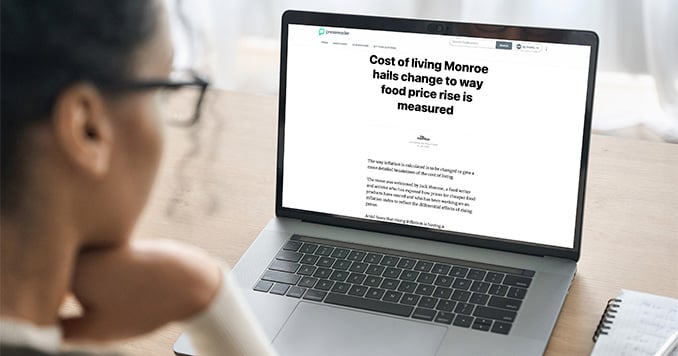
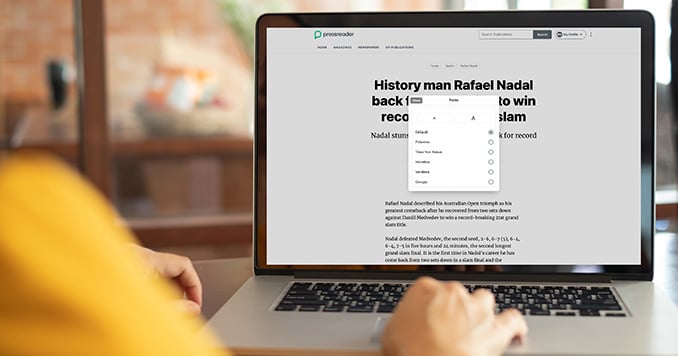
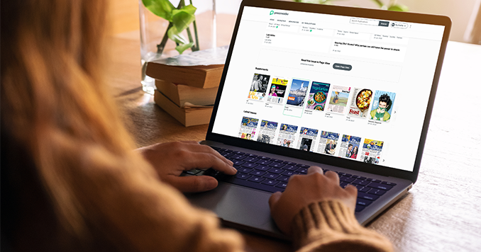
To ensure our content is perceivable, PressReader Accessibility has a number of features including font enhancement capabilities, so that readers can enlarge or shrink the font size as needed. Images on our home page and catalog also include alt text to indicate whether an item is a magazine or a newspaper. Plus, our Article View extracts text from the original newspaper or magazine and presents it in a way that’s easy to navigate and read from.
“In a world of bloated and cluttered news sites that never quite seem to manage consistent navigation or heading structure, PressReader’s accessibility mode offers a much smoother experience, and easy access to many publications in one place.”
National Network for Equitable Library Service (NNELS)
Operable
When it comes to operability, an accessible solution must have user interface components and navigation that are easy to use. This includes equipping the website with keyboard navigation and shortcuts, giving users enough time to read content that’s automated, reducing the chance of physical reactions to light, providing guidance for navigating the site and adopting additional navigation inputs beyond the keyboard (e.g. pointer gestures).
As part of PressReader Accessibility, we implemented robust keyboard navigation features that allow readers to browse publications with just a couple of keystrokes. The Search function is also easy to navigate and search results appear under category headings (e.g. news, magazines, articles).
Understandable
Content on the user interface needs to be understandable both by the reader and any assistive technologies including text-to-speech readers. As such, the content should be readable, the website should appear and operate in predictable ways and the web application should include input assistance that helps users avoid and correct mistakes.
According to the latest report on PressReader from NNELS, the logic of the catalog page is predictable in that the publications and categories cascade logically under headings that help sort the materials. Articles also load in a simple page view, with little clutter around the text, and are easily captured by screen readers.
Robust
Under the principle of robustness, content must be easily interpreted by a wide variety of user agents, including assistive technologies. It should accommodate the technologies of today, while also being adaptable enough to support any new software developments being made.
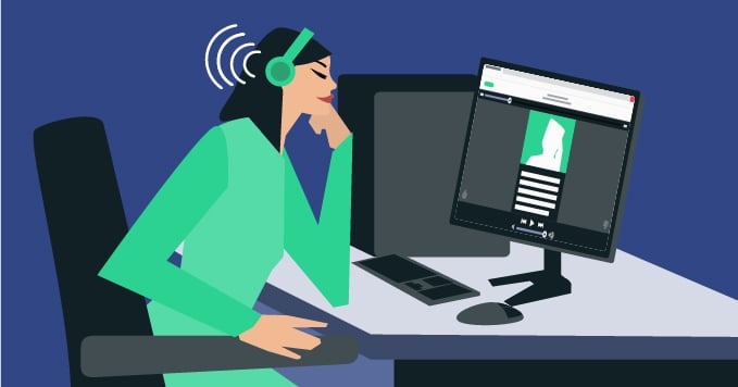
PressReader Accessibility was designed to be compatible with many popular screen readers on the market — this pairs well with libraries that offer their own assistive technologies for patrons. Readers can listen to any of the articles in our catalog on the device of their choice, when and where they want.
Making accessible content the norm
One of the things we’ve realized in building PressReader Accessibility is that we have an opportunity to design a platform that covers everyone’s needs in a single experience — and that’s the vision we’re moving towards. We’re already seeing this extensibility at play. For instance, our Article View feature is a welcome tool for researchers that work out of libraries. With no images and a simpler user experience, this tool makes it easier to comb through large volumes of material and surface relevant content faster.
As we consider the various needs of all our different readers and work with libraries to uncover how we can best support their patrons, we’re excited for how this will shape our platform moving forward.
To learn more about how PressReader Accessibility can help your patrons access the content they want without any barriers, get in touch.


